You’ve got your domain name and you’ve chosen your website platform and theme. Now comes the part that often terrifies new entrepreneurs: the “branding.”
It’s a word that brings to mind expensive design agencies, which big corporations sometimes spend literally millions of dollars with to create a brand.
Agencies deploy highly paid ‘artists’ and ‘designers’ to come up with color schemes, logos and typefaces (fonts) which are often shrouded in ‘deep thinking theory’, which in my humble opinion is just their excuse to charge ever higher fees.
For your purposes it is simply the fear that if you don’t get it “right,” your business will look amateurish from day one.
Whatever you do, don’t stress over this phase of your business launch. I am not a designer, (far from it!), and you probably aren’t either. Relax, there are tools at hand that can simplify all this and give you everything you need to complete the task.
Creating a clean, consistent, and professional look for my Digital Honesty HQ concept was just a matter of focusing on a simple concept: the Brand Kit, and you can do the same.
A Brand Kit is really just as simple as a one-page document that defines the three core elements of your visual identity: your colors, your fonts, and your logo. That’s it.
In this practical, no-nonsense workshop, I’m going to show you exactly how I built my own brand kit.
I’ll give you the simple tools I used, and at the bottom of this post I will share the exact prompts I fed to an AI to create my logo for free, get my fonts and decide what colors I needed.
The Psychology
of Colours
Before we get stuck into the nitty gritty of creating your brand kit, I want you to focus for a minute or two on the psychology behind colors.
Now, I know that some of you will pull me up on this because a couple of paragraphs ago I said that this sort of thing was just an excuse for agencies to charge higher fees. Ok you got me!
However, I (and neither should you) can not ignore some basic human reactions and emotions when it comes to colors, because this part is real and does have influence on peoples choices.
You may already have some idea of what your logo should look like, maybe you doodled it on paper, and have already assigned to it your preferences of color.
At this point it is worth considering the following: Who are your audience? What is the ‘vibe’ of your business? What is your character? How will you present yourself?
The answers to these types of questions and others like them are all determining factors in what kind of Brand Kit you will need or want to create.
So, take a quick look at the graphic below, which gives you a brief overview of how colours make a difference and influence humans to make logical and or emotional decisions.
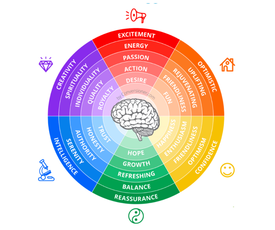
I have a more in depth look at the subject of the Psychology of Colors (Link to:) In this post. I would love it if you just took a few moments to look it over.
All that said, let’s get you set up with your Brand Kit.
Pillar 1: Your Color Palette (The “Feeling”)
Your colors set the mood for your entire brand, you just need a simple, proven formula.
The 4-Color Formula: I recommend starting with four core colors:
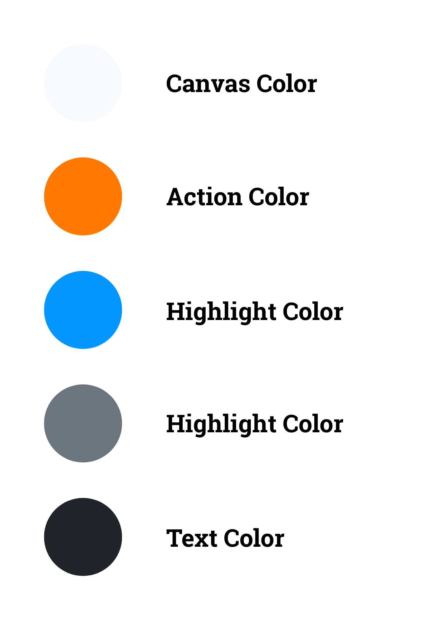
- A “Canvas” Color: A neutral background color. (I use a clean off-white).
- A “Text” Color: A dark, readable color for your text. (I use a soft, dark grey).
- An “Action” Color: One single, bright, vibrant color for your buttons and links. (This is my “Playful Truth Orange”).
- A “Highlight” color: A single contrasting color that compliments your ‘action’ color and adds depth and variation to your content.
The Tool I Used: I used a free tool called coolors.co, that can generate beautiful, professional color palettes in seconds.
With coolers you just need to create an account with your email, google or apple sign in.
Pillar 2: Your Typography
(The “Voice”)
Your fonts are the voice of your brand. A good font pairing makes your content a joy to read.
The 2-Font Formula: The simplest and most professional approach is to choose two fonts:
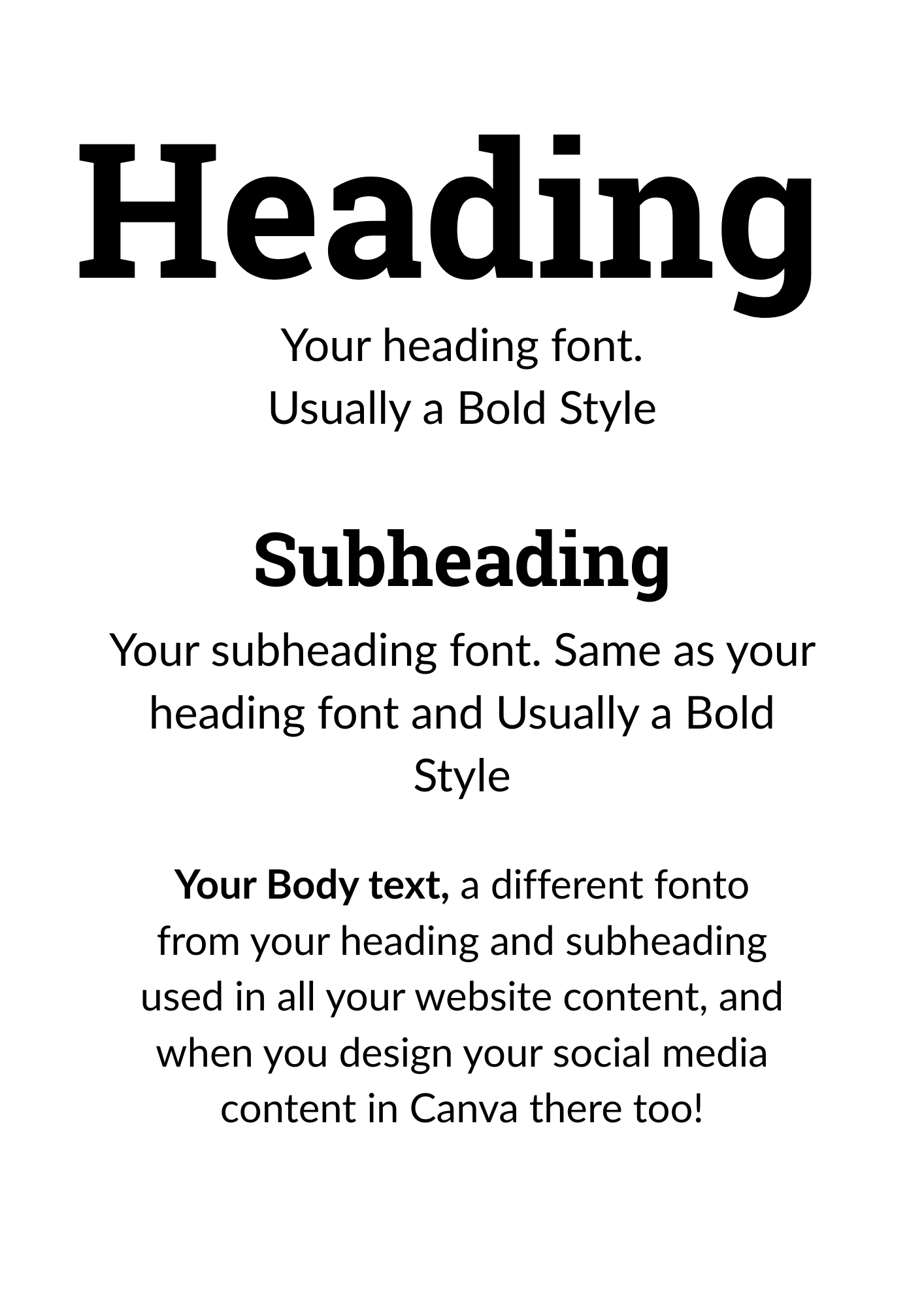
- A “Heading” Font: A bold, clear font for your titles and headlines. (I use Roboto Slab).
- A “Body” Font: An easy-to-read font for your main paragraphs. (I use Lato).
The Tool I Used: Google Fonts. It’s a massive, free library of professional fonts. I’ll show you how to find and choose a pairing that feels right for you.
TIP: In the main most web builders will use the google fonts library, so before you decide check in your web builder if its available for ease of use.
You can also download a font from Google Fonts for free and install it in your device or import it to your web builder if they allow it (and most do)
Pillar 3: Your Logo
(The “Face”)
This comes in two parts. Part 1 is the part that scares people the most, but it’s now the easiest part thanks to AI. You do not need to hire a designer to get a great starting logo.

Part 1:
- The “Minimalist Icon” Approach: Don’t over think this. A simple, clean icon is modern, professional, and works everywhere.
- The Tool I Used: Canva’s Magic AI Image Generator. It’s completely free and incredibly powerful.
- My Logo Prompt (Steal This!): Here is the exact, word-for-word prompt structure I used to create the Digital Honesty HQ logo. You Just need to add the #colour hex to it to get the colours you want (from your Coolers colour pallete)
Minimalist vector logo design for a brand called Digital Honesty HQ. The logo should be a simple, modern icon that represents guidance and trust, like a stylized compass or a shield. Use a clean, flat design style with a limited color palette of deep navy blue, white, and a single accent of trustworthy teal. The logo must be centered on a plain white background, suitable for a profile
Part 2:
- Your Face: A bright headshot (selfie style) of your shoulders and face to use on all your platforms. Remember people trust more if they can see who you are.
The Toolkit in Action: Assembling Your Brand Kit
Now that you have the three pillars, let’s put them together. The absolute best place to do this is inside Canva.
Canva is my mission control for all things design, and it has a fantastic feature called the “Brand Kit” where you can save your new colors, fonts, and logo. This allows you to apply your branding to any design with a single click.
The Honest Truth:
Canva Pro vs. The Free Version
Now, for a dose of digital honesty. The official, easy-to-use “Brand Kit” feature is part of the paid Canva Pro subscription. I personally pay for Canva Pro and believe it is one of the best value-for-money investments for my business because of the time it saves and the access it gives to premium photos and extra features.
However, you absolutely do not need to pay for it to get started.
I promised you a no-nonsense guide, and that means giving you a powerful, free alternative. Here is the simple, “bootstrap” method to create and use your own brand kit without spending a penny.
The “Bootstrap” Brand Kit: A Free Workaround in Canva
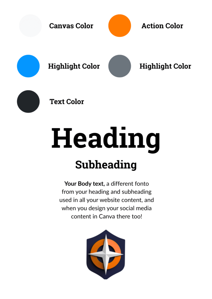
We are going to create a simple, one-page reference document inside Canva that will act as your free Brand Kit.
- Create a New Design: In Canva, create a new design. A simple “Document (A4)” or a presentation slide works perfectly. Name this design “My Brand Kit.”
- Add Your Colors: Create five small squares or corcles on the page. Click on each one, go to the color picker, and manually enter the HEX codes for your five brand colors (the ones you created in Coolers). Below each square, write the HEX code so you can easily copy it later.
- Add Your Fonts: Add two text boxes. In the first, type “My Heading Font” and style it using your chosen heading font in a bold weight. In the second, type “My Body Font” and style it using your body font in a regular weight.
- Add Your Logo: Upload and place your logo on this page.
- Use it as Your Template: Now, you have a single reference page. When you start a new design in Canva, you can have this “My Brand Kit” document open in another tab and you’ll have a constant visual reminder of your correct fonts.
It takes one extra click, but this bootstrap method gives you 90% of the benefit of the paid feature, for free. It is the perfect way to maintain professional consistency on a budget.
You Are Now a Designer (Even If You Don’t Feel Like One!)
That’s it. You’ve done it. You have a professional color palette, a readable font pairing, and a clean, modern logo. You have a complete Brand Kit.
You now have a system for creating beautiful, consistent visuals for your business. This isn’t just about looking good; it’s about building trust. When your brand looks cohesive and professional, your audience will instantly take you more seriously.
