When you design a homepage it becomes the most valuable piece of real estate you own online. It is your digital front door, your 24/7 salesperson, and your first (and often only) chance to make a lasting impression.
Don’t start to sweat though. In this post I am going to walk you through the whys and wherefores of getting it built!
So, as soon as a potential viewer or customer sees your home page, it must answer 3 questions to the person reading it and you have about five seconds to get those questions answered.
- Where am I?
- What can I do here?
- Why should I care?
In this day and age of ever-shortening attention spans, if your home page can’t answer those questions instantly, readers and potential customers will click the “back” button and be gone forever.
It’s a terrifying amount of pressure, especially if you’re not a designer. But here’s the honest truth: a high-performing homepage isn’t about flashy design; it’s about clear communication.
It’s about simplicity and not overthinking it, you will have ample chances to get your viewers to stick around and read and interact with your content, if you get the home page right.
In this workshop, I’m going to pull back the curtain and show you the exact, no-nonsense framework I used to build the homepage for Digital Honesty HQ.
We’ll go through it section by section, and I’ll give you a simple, repeatable blueprint you can use to design a homepage that hooks your ideal visitor and turns them into a loyal reader, subscriber and paying customer.
The Anatomy of a
High-Converting Homepage
Forget about trying to be clever or flash, remember this process is about simplicity and clear communication. I suspect that very few of you reading this are designers of any sort, (especially me!).
To design a homepage it follows a proven, logical flow. It takes the visitor on a journey, from understanding who you are and what your site is about, to taking the action you want them to take.
We can break this down into four essential sections of that journey. When I say sections, what I mean is they are the four sections of a single web page. (Your home page).
This is not 4 separate pages that a reader has to navigate to using a menu but rather a continuous scroll that reveals all the key elements that you want to get over to your readers.
So think of this as just one page with four sections, and here is how we can view those sections graphically.
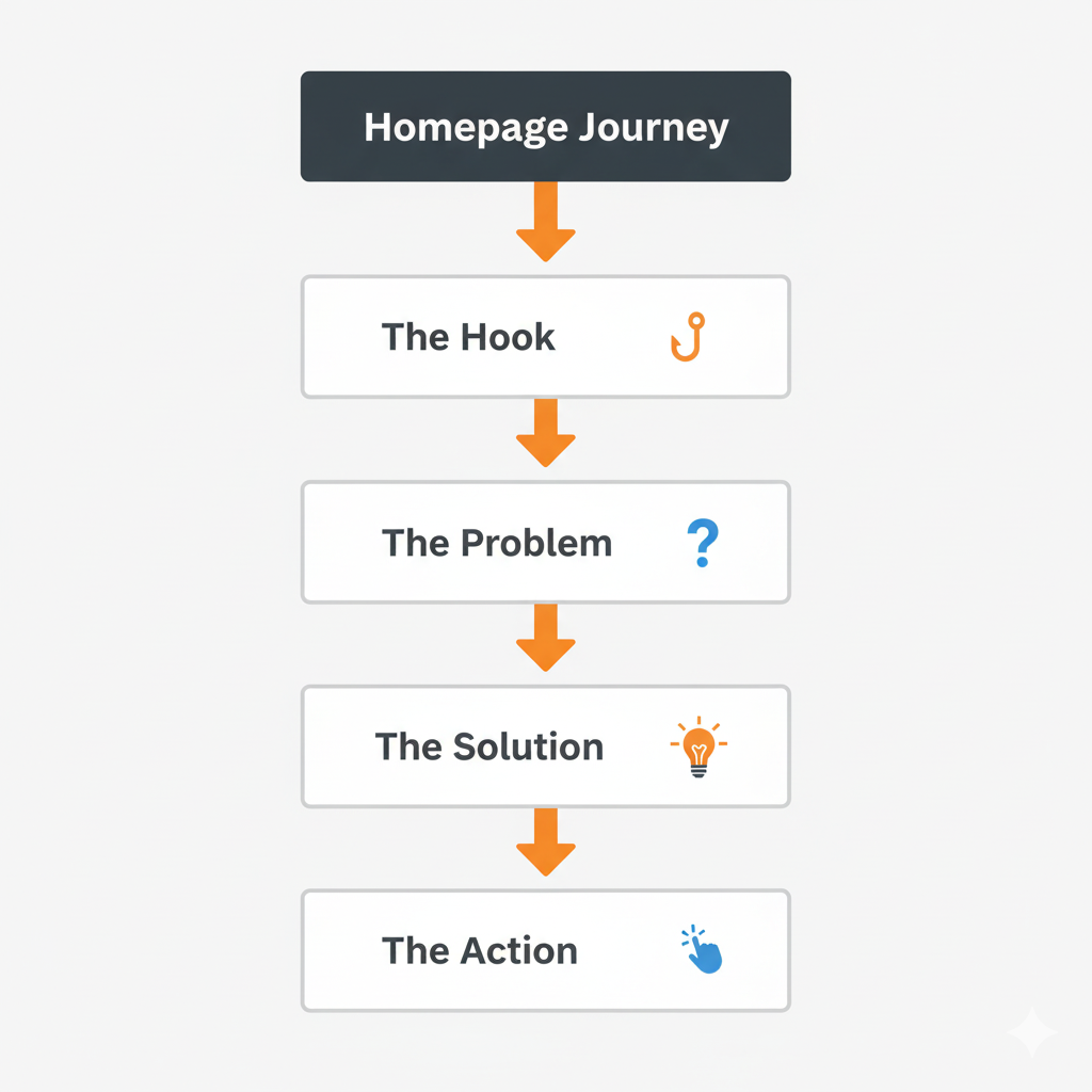
So let’s take a look at those sections one by one.
Section 1: The “Hero” (The Hook)
This is the very first thing a visitor sees. Its only job is to get them to stop and say,
“Okay, this might be for me”
So don’t clutter it up with pointless images or text blocks that don’t answer the three questions I outlined previously.
The Key Elements:
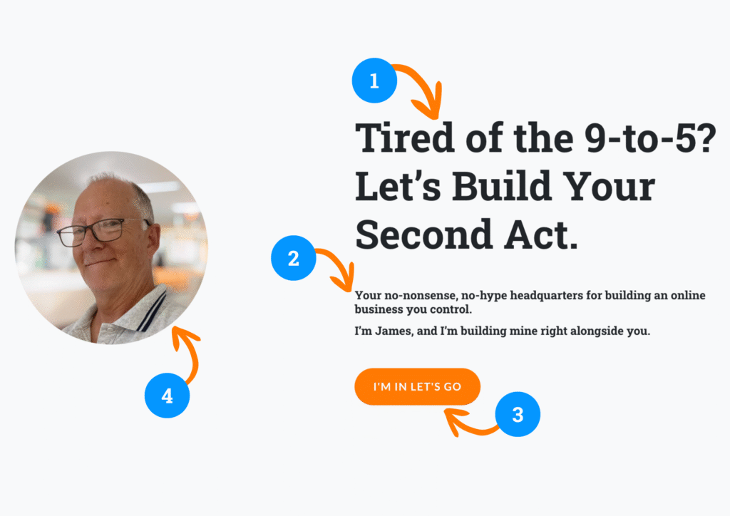
- A Benefit-Driven Headline: Don’t just say what you do; say what you do for them. (My headline: “Tired of the 9-to-5? Let’s Build Your Second Act.”)
- A Clear Sub-headline: A simple sentence that explains who you are and what the site is about.
- A Clear Call to Action: One single, obvious button that tells them what to do next. (My button: “I’m In. Let’s Go!”)
- A Human Face: A professional, friendly photo of you. People connect with people.
Here is an example of the key elements.
Section 2: The Empathy Bridge (The Problem)
Once you’ve hooked them, you need to prove you understand them. This section speaks directly to their pain point.
The Key Elements:
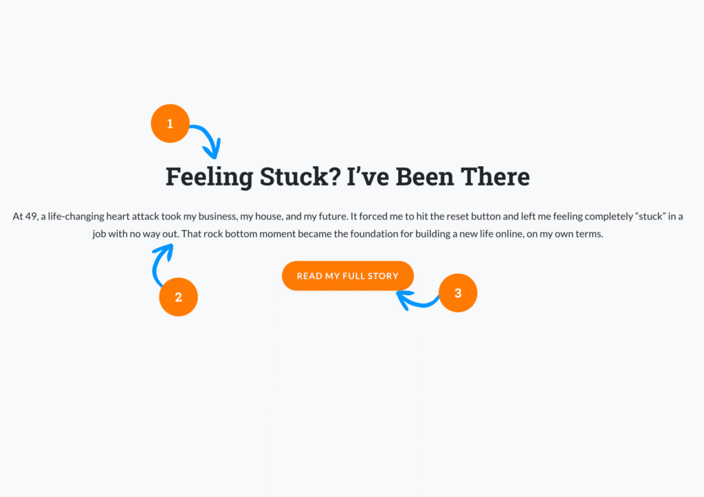
- A Relatable Headline: A simple statement that shows you’ve been where they are. (My headline: “Feeling Stuck? I’ve Been There.”)
- Your “Reset” Story: A very short, 2-3 sentence summary of your personal struggle. This builds an instant, powerful emotional connection.
- A Low-Commitment Next Step: A button that invites them to learn more, not to buy. (My button: “Read My Full Story”). Don’t try to sell anything on your home page!
Section 3: The Roadmap (The Solution)
You’ve shown them you understand their problem. Now, you need to show them you have a plan to solve it. This is where you introduce your content pillars.
The Key Elements:
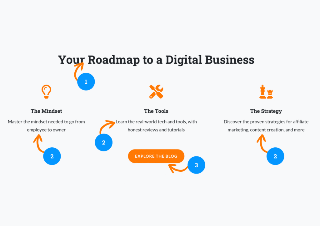
- A Guiding Headline: Frame your content as a solution. (My headline: “Your Roadmap to a Digital Business.”)
- Your Content Pillars: Break down your value into 3-4 clear, benefit-driven categories. (My pillars: The Mindset, The Tools, The Strategy). This shows the breadth of your expertise and gives them a clear overview of your content.
- An Invitation to Explore: A button that encourages them to dive into your content library. (My button: “Explore the Blog“).
Section 4: The Conversion (The Action)
This is the final and some would say the most important section. To build a homepage it must have a primary business goal.
For a new creator, that goal is always the same: build your email list.
If you are using WordPress with or without the Divi Theme you can create a form or ‘email capture’ with tools that are built into Divi and WordPress, and link them to your Mailerlite account.
You can also use your Mailerlite Account to create forms and pop ups that can be embedded in your site to achieve the same thing.
So, how do you build that email list? What do you need to do to engage a viewer enough to give you their email address? What do they get in return?
Remember that the goal here is just to get the email address.
This is NOT an opportunity to sell them anything, it’s way too early in your interaction with them to try and push a paid product onto them.
You are building authority and trust first, so you need to give them something that has an educational value that they consume and react to.
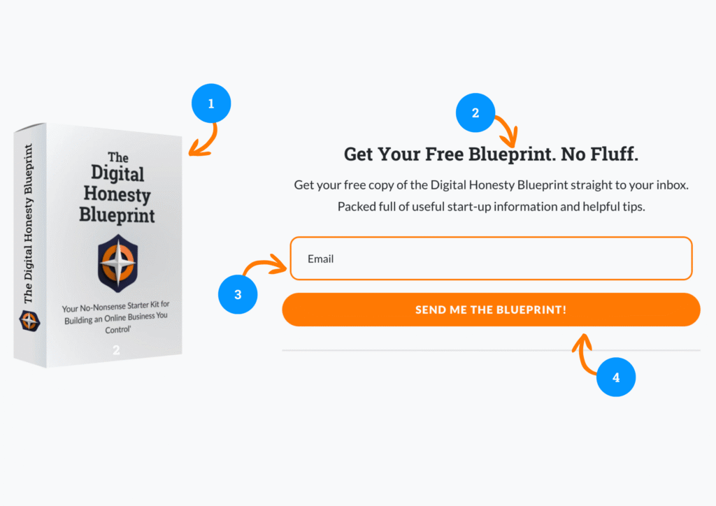
The Key Elements for your email capture are:
- A Powerful Offer: Your free e-book (your lead magnet).
- A Clear Headline: State the benefit of the offer. (My headline: “Get Your Free Blueprint. No Fluff.”)
- A Simple Form: Make it as easy as possible. Just ask for their email address.
- A High-Conversion Button: Use your action color and compelling, low-friction text. (My button: “Send Me the Guide!”).
Your Homepage is a Conversation, Not a Brochure
As you can see, to build and design a homepage that is great isn’t a random collection of pretty elements. It’s a structured, simple, communicative strategic conversation.
It greets your visitor, shows them you understand their problem, presents your plan for a solution, and invites them to take the first, valuable step.
By following this simple four-part framework, you can turn your homepage from a digital brochure into your most powerful conversion tool.
